Note: Common UI is an Experimental plugin released in Unreal Engine 4.27. It is possible that widgets described below may be removed or their interfaces significantly changed between 4.27 and their final release.
This is the second part of my series on Epic's Common UI plugin for Unreal Engine. The introduction has a full list of pages.
General
Common UI's button widget and related classes are really, really good examples
to learn from if you want to make your own Button class. It's clear that the Common
Button class is the result of heavy use within Epic and has a bunch of useful
features and fixes over Unreal's default UButton class.
- Centralized styling using assets.
- Support for a Selected state, useful for making toggle-able buttons.
- Centralized text styling, using the same text style asset as the Common Text widget.
- On-Click delegates pass a pointer to the button that clicked them, useful when binding many button instances to the same function.
- Tooltip shows even when the button is disabled.
- Minimum desired width/height properties to ensure a standard size for buttons.
I think it's useful to look at how they achieved this and maybe copy it for your own widgets.
CommonButtonBase
UCommonButtonBase is the main button class in the Common UI Plugin.
The most important thing to understand is that it is a User Widget
subclass, unlike UButton.
This has a few benefits:
- Making them a UserWidget means that designers are free to design and create classes of buttons to re-use through the UI, all with the same button logic.
- Centralized styling also allows many different Blueprint subclasses with different layouts to use the same core style asset.
I implemented this same approach for Industries of Titan and found it incredibly useful.
A Note on Class Hierarchy
It's worth talking clarifying a little more the relationship between these classes.
UCommonButtonBaseis a child ofUUserWidget.- Almost all built-in widgets in Unreal are direct-ish children of
UWidget.UCommonButtonBaseis the exception. - It is marked
Abstractso you will need to create a Blueprint subclass of it before you can place one in your widget hierarchy. - The naming convention isn't great in my opinion. I like to name my
UserWidget subclasses with
UWin the name. e.g.UBUIUWButtonBase.
- Almost all built-in widgets in Unreal are direct-ish children of
UCommonButtonBasehas an internalUWidget-subclassed button widget calledUCommonButtonInternalBase. This is close to the standardUButtonclass but you shouldn't be using it. I talk about how it's used a little more below.
Changing the tree root
CommonButtonBase does a very interesting thing inside its Initialize
function where it replaces its own root with an instance of a custom button
class. This instance is what handles all clicks and is styled by selected style
assets.
CommonButtonBase replaces tree root widget
bool UCommonButtonBase::Initialize()
{
	const bool bInitializedThisCall = Super::Initialize();

	if (bInitializedThisCall)
	{
		UCommonButtonInternalBase* RootButtonRaw = ConstructInternalButton();

		RootButtonRaw->ClickMethod = ClickMethod;
		RootButtonRaw->TouchMethod = TouchMethod;
		RootButtonRaw->PressMethod = PressMethod;
		RootButtonRaw->IsFocusable = bIsFocusable;
		RootButtonRaw->SetButtonEnabled(bButtonEnabled);
		RootButtonRaw->SetInteractionEnabled(bInteractionEnabled);
		RootButton = RootButtonRaw;

		if (WidgetTree->RootWidget)
		{
			UButtonSlot* NewSlot = Cast<UButtonSlot>(RootButtonRaw->AddChild(WidgetTree->RootWidget));
			NewSlot->SetPadding(FMargin());
			NewSlot->SetHorizontalAlignment(EHorizontalAlignment::HAlign_Fill);
			NewSlot->SetVerticalAlignment(EVerticalAlignment::VAlign_Fill);
			WidgetTree->RootWidget = RootButtonRaw;

			RootButton->OnClicked.AddUniqueDynamic(this, &UCommonButtonBase::HandleButtonClicked);
			RootButton->HandleDoubleClicked.BindUObject(this, &UCommonButtonBase::HandleButtonDoubleClicked);
			RootButton->OnReceivedFocus.BindUObject(this, &UCommonButtonBase::HandleFocusReceived);
			RootButton->OnPressed.AddUniqueDynamic(this, &UCommonButtonBase::HandleButtonPressed);
			RootButton->OnReleased.AddUniqueDynamic(this, &UCommonButtonBase::HandleButtonReleased);
		}
	}

	return bInitializedThisCall;
}
In my own similar class UBYGUWButtonBase I had a custom UButton alternative
but I used it just through meta=(Bindwidget). Using BindWidget allows
designers to change where the button is in the hierarchy.
Common Button Style
CommonButtonBase uses Button Style assets to define its appearance. Buttons
have 7 states, and the style asset has a texture slot for each:
- Normal
- Normal Hovered
- Normal Pressed
- Selected Base
- Selected Hovered
- Selected Pressed
- Disabled
Common Button Style Properties
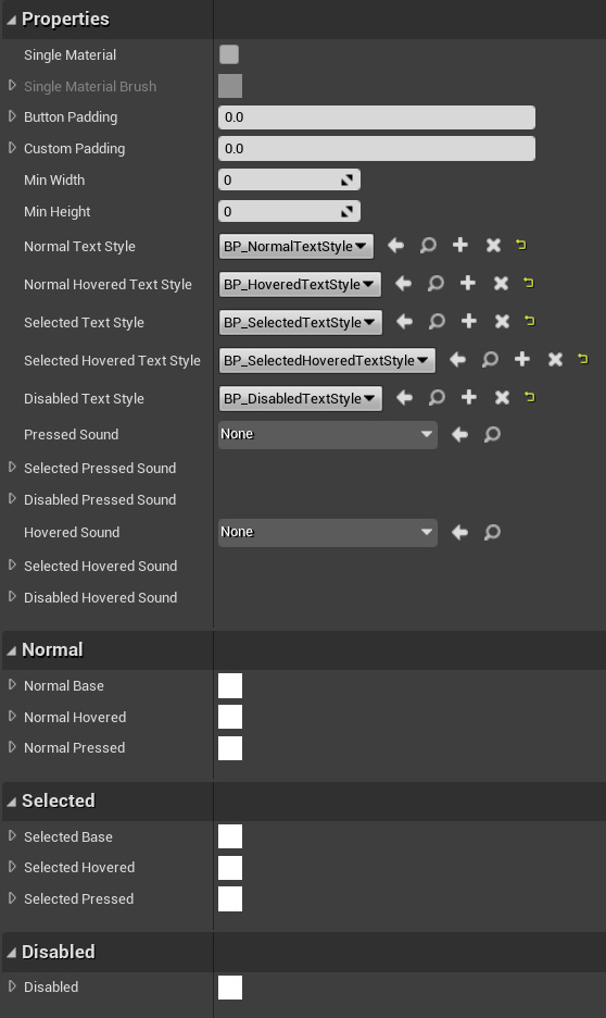
As shown in the screenshot there is a checkbox for "Single Material" that enables selecting a material brush. As far as I can tell there is no built-in functionality associated with this, but I can imagine wanting to use a single material for all 7 states and setting a material instance parameter to change the look of the material instance.
The style asset also has properties for changing the appearance of the text. Each of these uses the same text style asset mentioned previously:
- Normal text style
- Normal hovered text style
- Selected text style
- Selected hovered text style
- Disabled text style
Applying Common Button Text Styles
The weird thing is that out of the box, UCommonButtonBase will apply the
defined brush styles to itself when the state changes, but it won't apply the
corresponding text style to anything inside it. To make your text change to the
correct text appearance, create a subclass of UCommonButtonBase and override
the NativeOnCurrentTextStyleChanged() function and use the class returned by
CurrentTextStyleClass().
MyCommonButton.h
#pragma once

#include "CommonButtonBase.h"
#include "MyCommonButton.generated.h"

UCLASS(Abstract, meta = (DisableNativeTick))
class UMyCommonButton : public UCommonButtonBase
{
	GENERATED_BODY()
protected:
	virtual void NativeOnCurrentTextStyleChanged() override;

	UPROPERTY(meta = (BindWidget))
	class UCommonTextBlock* MyButtonTextLabel;
};
MyCommonButton.cpp
#include "MyCommonButton.h"
#include "CommonTextBlock.h"

void UMyCommonButton::NativeOnCurrentTextStyleChanged()
{
	Super::NativeOnCurrentTextStyleChanged();
	MyButtonTextLabel->SetStyle(GetCurrentTextStyleClass());
}
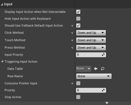
Actions
One big topic I have been avoiding is Common UI's new Input Action system. The Common Button uses this but I'll cover this in a future tutorial.
Common Button Input Properties