Welcome to the first in a series of tutorials on creating UIs in Unreal. Most other tutorials I've seen online only cover basic UI creation using Blueprints alone, however this series is focussed on creating professional-quality UIs in Unreal using both C++ and Blueprints.
The tutorial series can be broken down into three major sections:
- Cover the basics of creating UIs in the editor, using UMG and Blueprints.
- Transition to implementing our UI logic in C++, and tying it to visuals in UMG.
- Learning how to create new types of base widgets in pure C++.
Prerequisites
Before starting this series you should:
- Have experience with the basics of Unreal — the Content Browser, creating and scripting Blueprints, the concept of UObjects.
- Be competent with C++. You don't have to be an expert, but you should understand inheritance, pointers, references, etc.
- Be comfortable with creating C++ classes and using them in Unreal. There are many great tutorials that cover creating components and other code in C++.
- Have access to the Unreal engine source code from Github.
- Have a passion for creating UIs :)
Let's Get Started
The first thing we will be dealing with is UMG, the name given to Unreal 4's latest UI system. We will first get used to using it from within the editor, and learn what its features and limitations are.
In order to get started with UMG, the first thing you should do is create a space that lets you experiment with the UI tools available.
In the case of level design this would be making a new Map asset in Unreal. In the case of UMG, you need to create a UserWidget asset. We'll talk about what UserWidgets are in detail below. For now:
- Right-click in the Content Browser.
- Under the User Interface menu at the bottom, select Widget Blueprint from the pop-up menu and call it something like
WBP_MyWidget. - Double-click on the newly-created asset to open it.
Note It's standard to name Widget Blueprints starting with WBP_ for Widget Blueprint.
At first Unreal's UMG system can be a bit daunting. There are a large number of widgets, a large number of options on each one, and learning how they all affect each other is quite a steep learning curve. But don't panic, this stuff will make sense the more you use it. I promise :)
The editor view on UserWidgets is split into two tabs, shown in the top-right. The Designer view and the Graph view. They are two views onto the same widget, one is its visual aspect, the other its logic.
- The Designer view is where you set up how your UserWidget will look when it is created. You can add new widgets, lay them out, change their default properties.
- The Graph view is where you set up your Blueprint logic and control how the widget will behave in-game.
Designer View
Designer View Example
Note that 'Designer' is selected in the top right.

The screen presented to you is composed of a few parts:
- Palette: Lists all the widgets available to you
- Hierarchy: The tree view of your UserWidget, with the UserWidget's
root at the very top. You can click on any of the widgets to select them.
- Widgets in bold are "Is Variable" widgets. These are available in the Graph view.
- Viewport: The selected widget is shown with a green border.
- Details: Shows the properties available on the currently-selected widget.
- Animations: Lists animations within the current UserWidget
- Timeline: Shows the timeline of events for the currently-selected animation
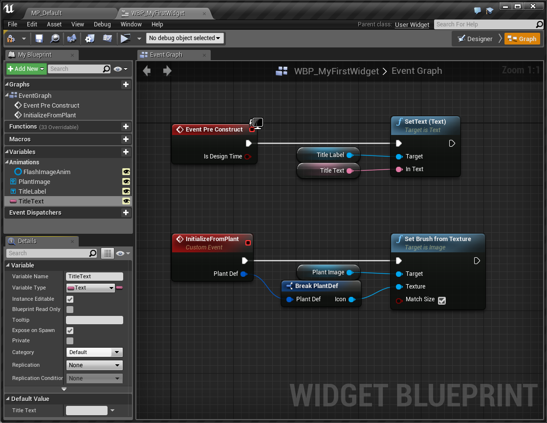
Graph View
The graph view is selectable from the top-right of the UserWidget blueprint window.
From here it's possible to:
- Create new Blueprint nodes to control our UserWidget and its contents.
- Create new Blueprint variables
- Change the default values of our UserWidget's variables, whether those variables are defined locally in the Blueprint, or in parent C++ classes (discussed later).
Graph View Example
Note that 'Graph' is selected in the top right.
Nesting and Slots
Now that we've covered navigating around the interface, let's cover some theory related to UMG.
The first thing to understand is that the "document" in UMG is a tree of nested widgets. By putting widgets inside other widgets, we control how they are arranged on the screen.
The number of children a widget can contain depends on the widget:
- Cannot contain children:
Image,TextBlock - Can contain at most one child: UserWidget root,
Border,NamedSlot - Can contain many children:
CanvasPanel,Overlay,WidgetSwitcher,HorizontalBox,VerticalBox
(This is not an exhaustive list)
Slots
When a widget is put inside another, we can customise how it behaves inside its parent through its Slot property. In the editor it's the first set of variables shown in the the property view.
Canvas Panel Slot vs Overlay Slot
On the left, Image_1 is inside a CanvasPanel. On the right it is inside an OverlayPanel. Note the slot properties are different.
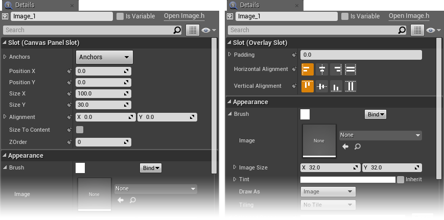
Notice in the screenshot that our Image widget's Slot properties are different depending on whether it's inside an Overlay or a Canvas widget.
In the Overlay Slot property we can set how the widget is stretched or aligned in its parent. The Canvas Panel Slot gives us the option of setting pixel-based offsets from the edges of the parent.
Getting used to how Slots work is a core part of understanding UMG. Take the time to play with putting widgets inside others and seeing how they are arranged.
Widgets
We're not going to list every type of widget here and explain what each one does. The best thing you can do as a new UI developer is to try out each widget and see what you can do with it. What options it has, if it can contain children what the options child slots etc.
To give you an idea of where to start, here's a list of widgets that are most commonly used. Try out each of these, read up about them, see what they do in the editor and how to use them from Blueprints.
- Basic Widgets: Image, TextBlock, Button
- Basic Containers: Overlay, Canvas, HorizontalBox, VerticalBox, UniformGrid
- Intermediate Widgets: Border
- Advanced Widgets: NamedSlot, RetainerBox
If you can understand how to use these widgets you should be able to make pretty much anything.
UserWidgets
Your experimentations above should have been done inside a UserWidget. So what's a UserWidget? Similar to the way Blueprint Classes are used to create reusable objects with custom logic in maps, UserWidgets are used to create reusable objects with custom logic for user interfaces.
UserWidgets could be used to create anything, but here are a few simple examples:
- A custom button UserWidget that includes a Button instance, a TextBlock for the label, and an Image for the icon.
- A health bar Userwidget that uses a ProgressBar widget and TextBlock to show the percentage health and a value.
- A tooltip UserWidget, that creates a decorative panel using Image widgets, and a NamedSlot widget to arrange the contents.
Example Using UserWidgets
Simple example showing a page title and large button UserWidget. We can build up more complex widgets from re-usable individual pieces.
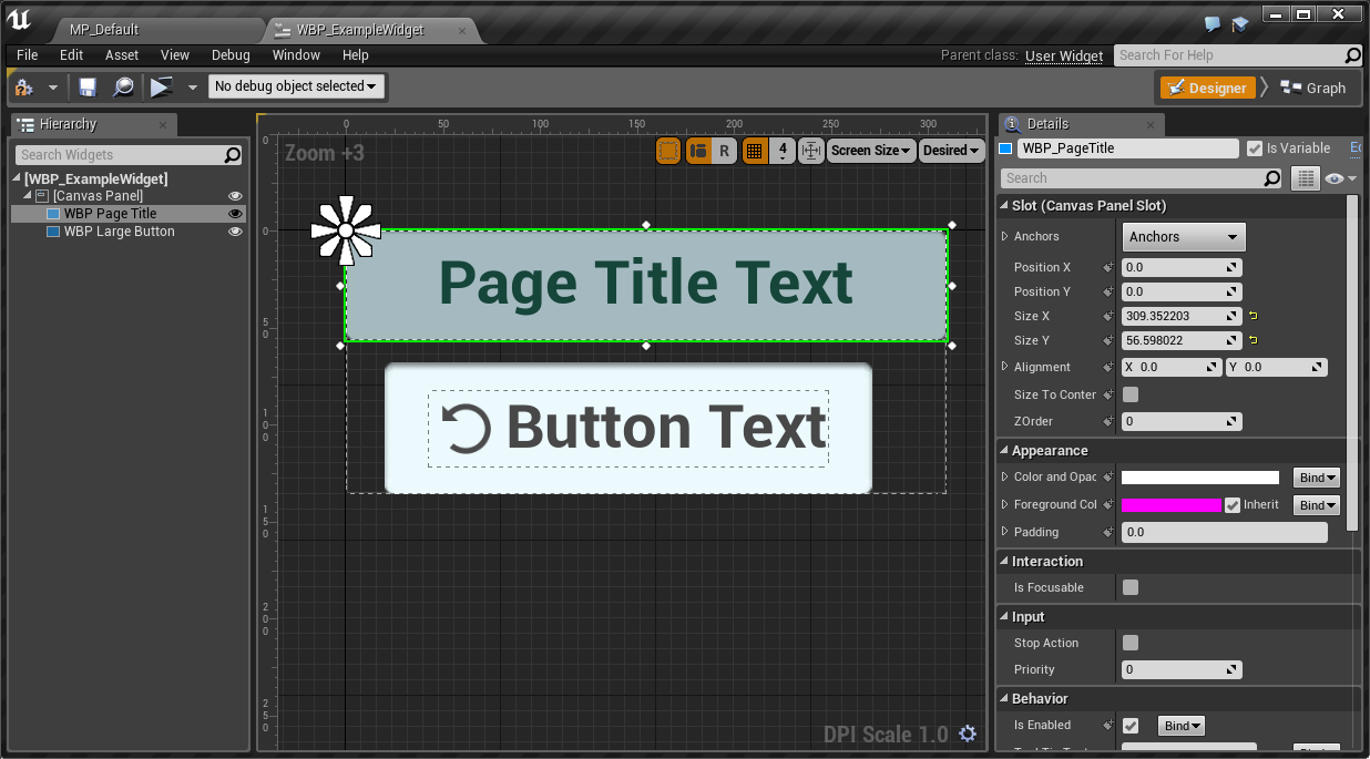
It's important to note that you could create the same behaviour with just regular widgets, and copy-paste them to create identical-looking buttons. In the case of the PageTitle, there is only one instance of it on the page so I wouldn't even have to copy-paste!
As a UI programmer and designer it's up to you to decide whether or not to
create UserWidgets for elements, whether they'd be better served by using
existing Widgets, or whether it would be worth creating your own C++ based
Widget. We will cover the latter of these in our more advanced tutorials on
creating new UWidget subclasses in C++ and
creating Slate classes in C++.
However in general there are some guidelines for when it's better to create a UserWidget rather than copy-pasting a set of regular widgets:
- When you want widgets with the same visuals in multiple parts of your UI.
- When the widgets need complicated or very specific logic to set up their appearance or contents.
- When you need to need to add and delete pre-styled widgets at run-time.