You're making a video game, you don't have time to read hundreds of years of typographic theory, but at the same time you want to make something that doesn't suck.
Let's do that, let's learn how to pick fonts for a game that don't suck.
The Basics
Before diving in, we need to cover a few basic concepts, they'll help when talking about what we need when choosing typefaces for your game.
DejaVu typeface example
A single typeface can have many variants and weights.
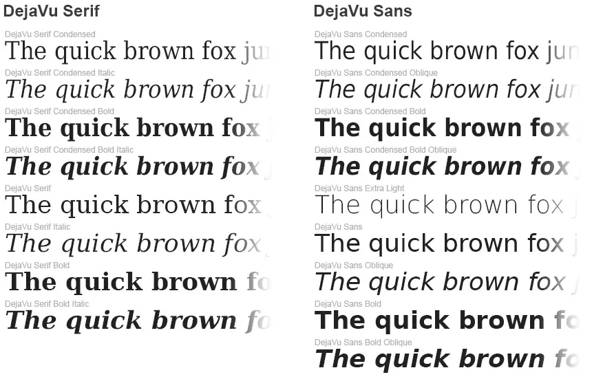
A typeface is a set of fonts that together make up a font family. A single typeface can have many variants, for example bold and italic. It can also contain many weights, from lighter thinner-looking weights to heaver weights like bold.
In the example above, DejaVu has two variants, a serif font (one with sticky-out bits) and one without.
The Playtype Glossary has more in-depth information on various terms.
Body and Display Typefaces
As a game developer, the most important distinction you should know when choosing typefaces is between body typefaces and display typefaces.
Body typefaces:
- Used to display large amounts of text
- Clear, easy to read
- Work at small sizes
Display typefaces:
- Designed to work best at larger sizes
- Stylized, flavourful
Display and Body usage in Splatoon
Splatoon uses a custom-made gorgeous inky-squiddy typeface for its display typeface, and a simple sans-serif for its body typeface.

Choosing Typeface Combinations
Now we understand the purpose of Display and Body typefaces, what do we do with that information.
So now that we have the basics out of the way, how do we choose typefaces? For your game you should choose a typeface to use at large sizes, for your titles, headings, large buttons, and a body typeface for your smaller text.
As long as you don't use a display typeface in your smaller text, there's not much you can do to go wrong.
Display
The display typeface should be something that tells players about your world. If your game is set in medieval times, a blackletter typeface like Coroner used in titles could help give that feeling to players.
Coroner Example

Or something handwritten and fun like Pitos.
To use Splatoon as an example again, its feel perfectly fits the world. But Nintendo smartly only uses it for titles.
Body
Your body typeface should be easy-to-read. Don't try to cram more world-building into it. You should choose a simple sans-serif typeface, or maybe a simple serif typeface if your game really needs it.
As a UI designer it's very tempting to try to inject more flavour into the UI by chosing something 'flashy' for the body typeface. Don't do this. You'll be surprised how little world-feel players get from the body text, compared to other UI aesthetics. Spend more time adding flavour to UI elements and display typeface.
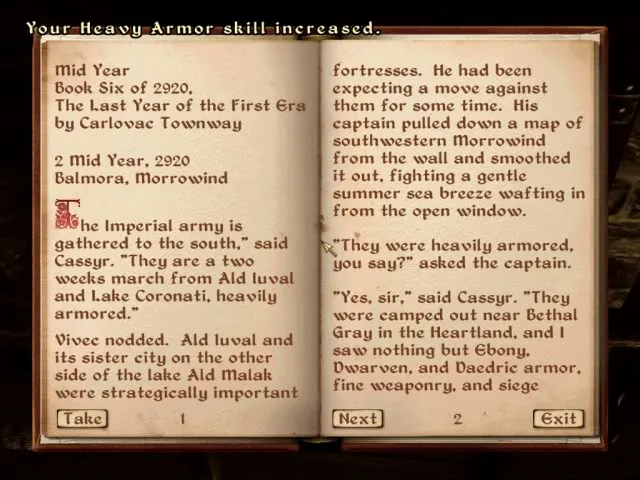
Using a display typeface in body text
The Elder Scrolls: Oblivion uses a _display typeface_ for its _body typeface_ in its books, making them more tiring to read.
How to tell if a typeface is good
What to look for in a good body typeface:
Check Font Weights and Italic Support
It is incredibly useful to be able to use bold to emphasize parts of your body text.
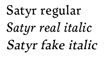
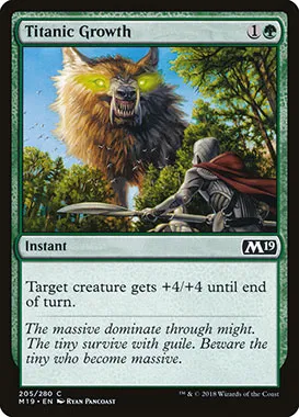
Similarly, italics can be used to emphasize text as in the Magic the Gathering example below. Italic variants of typefaces are not just tilted versions of the original, the letters shapes are usually significantly different.
Satyr regular and italic
Notice there are no serifs at the bottom of the 'r' in the italic. It looks closer to handwriting. 'Fake italic' is just tilting the regular font.
Italics in use
Magic the Gathering puts lore text in italics, clearly differentiating it from gameplay-related text.
Check the Kerning
Kerning is the spacing between characters. Typefaces with bad kerning can cause characters to blur together, or more likely, create unsightly gaps between letters.
Check Character Support
You love that display font, but does it have a quote character? What about a question mark character? Are your writers going to be OK with not being able to use those characters in titles?
Check Language Support
You're targeting English now, but what about in the future? If you can choose a typeface that supports multiple languages, you're going to save yourself a lot of headaches in the future
Putting it Together
Throwing together a very rough example for our ficticious medieval game, I chose Coroner as our display typeface and Satyr as our body typeface.
A rough worked example

Further Reading
- Detail in Typography by Jost Hochuli — An extremely concise, beautiful summary of some of the most interesting aspects of typography
- The Elements of Typographic Style by Robert Bringhurst — More of a reference book than Detail in Typography, I still found this fairly useful.
- Zach Gage's "Building Games That Can Be Understood at a Glance" (Video) (Slides)