One of the best ways of improving in UI/UX design trying new things out, seeing what works what doesn't and learning from your own mistakes. The problem with learning from your own mistakes is that you have to take the time to make them first. You can shortcut this by playing a huge number of lower-budget games with a critical eye.
Looking at high-quality games is great for inspiration and goals for a level of polish to achieve, but first it's important to make sure the fundamental user experience of your game is excellent.
I've found that it's harder to understand why a game with amazing UI is such a joy to use. It's usually the result of a large number of well-integrated design choices that support each other.
On the other hand when something feels a little off, it's easier to identify one or two contributing factors.
So play games that are good, but have room for improvement. Games that obviously made with love but maybe the focus wasn't on the UI. I want to make it clear that these are not bad games, They're just games that I think could do with some refinement in their UI.
Worked Example
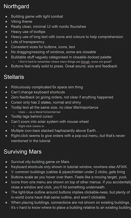
Industries of Titan was the first strategy game that I worked on, so I started out by doing my research. This took the form of playing every single strategy and city-building game that I could get my hands on. More importantly, I took notes and screenshots as I did, making note of anything particularly great or particularly frustrating. I threw all of these notes and screenshots to illustrate my points into a slideshow document.
Notes I made while playing some strategy games. These are fairly small nitpicks but by analysing other games I think I can learn from them.

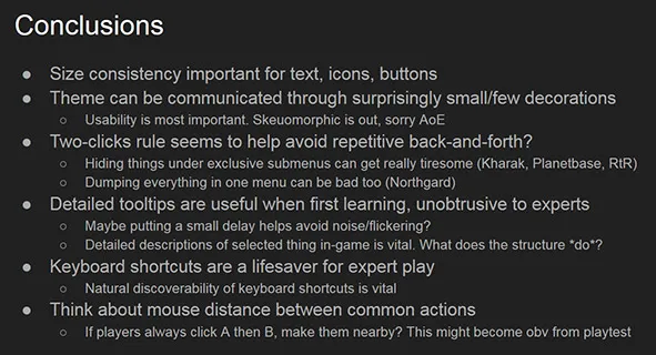
At the end of the document I kept an updated summary of problems and elegant solutions that popped up many times across multiple games.
Some of the summary I put together from playing a tonne of strategy and city builder games.

The First 15 Minutes
I found that the first 15 minutes with a game are incredibly valuable. It's before you've got used to the quirks of the game, before the quality of the gameplay has let you forgive any oddities in the interface.
So as I play each game, I try to take it slow and be extremely mindful of what's going through my mind all the time, and how this applied to strategy games and city-builders:
- How easy was it to know what to do in the first few minutes?
- What should I build first? What do I do with my units? Where should I expand?
- Were there some game concepts that took a while to make sense?
- What's the difference between "Gold" and "Gems"?
- These units have armor, but these have shields, what is affected by that?
- This upgrade gives +10 to fuel efficiency, is that a lot?
- Did some buttons or icons not make sense until I used them for a few times?
- This button is labelled "Sell" but it doesn't tell me how much I will get for selling it, will it show a confirmation panel?
- This weird swirly icon is lit up, what does that mean?
- Was there something I tried to achieve but couldn't work out how to do it through the interface?
- Is that a button? What can I click on?
- Why is this button disabled?
- It's telling me I don't have enough power, where is the thing to solve that?
Using What I Learned
With this mindset I've found it easier to go back to a game that I'm working on and look at it with a critical eye, approaching it as if I were a first-time player.
When designing new UI elements I often refer back to the conclusions at the end of the slideshow to remind myself of things to avoid, or things that worked particularly well.