Note: Common UI is an Experimental plugin released in Unreal Engine 4.27. It is possible that widgets described below may be removed or their interfaces significantly changed between 4.27 and their final release.
Common UI is a plugin from Epic that provides more advanced (and experimental) widgets that their engineers created while working on Fortnite and other projects.
If it is your first time with Common UI, I recommend reading the introduction to learn why it might be useful.
Common Text
UCommonTextBlock is a subclass of UTextBlock so it has all of the functionality you would expect from a regular Text widget. Its has a few major additions:
- Centralized text styling through
UCommonTextStyleassets to define how the text should appear. - Allows for marquee-style scrolling through the Scroll Style asset.
- An "Auto Collapse When Empty Text" property that does what you might expect.
Making Parent Properties Read-Only
One interesting thing about UCommonTextBlock is that because it is a subclass of UTextBlock, it still has all of the non-centralized styling properties like Font, ColorAndOpacity etc.
When a UCommonTextStyle is set, these properties are marked read-only by overriding the editor-only CanEditChange function. I'm definitely going to be using this in the future!
CommonTextBlock.cpp
#if WITH_EDITOR
bool UCommonTextBlock::CanEditChange(const FProperty* InProperty) const
{
	if (Super::CanEditChange(InProperty))
	{
		if (const UCommonTextStyle* TextStyle = GetStyleCDO())
		{
			static TArray<FName> InvalidPropertiesWithStyle =
			{
				GET_MEMBER_NAME_CHECKED(UCommonTextBlock, Font),
				GET_MEMBER_NAME_CHECKED(UCommonTextBlock, StrikeBrush),
				GET_MEMBER_NAME_CHECKED(UCommonTextBlock, Margin),
				GET_MEMBER_NAME_CHECKED(UCommonTextBlock, LineHeightPercentage),
				GET_MEMBER_NAME_CHECKED(UCommonTextBlock, ColorAndOpacity),
				GET_MEMBER_NAME_CHECKED(UCommonTextBlock, ShadowOffset),
				GET_MEMBER_NAME_CHECKED(UCommonTextBlock, ShadowColorAndOpacity)
			};

			return !InvalidPropertiesWithStyle.Contains(InProperty->GetFName());
		}

		if (bAutoCollapseWithEmptyText && InProperty->GetFName() == GET_MEMBER_NAME_CHECKED(UCommonTextBlock, Visibility))
		{
			return false;
		}

		return true;
	}

	return false;
}
#endif
Common Text Style Asset
Instead of having to change the properties on hundreds of individual Text Widget instances, a single style asset can be used to control the appearance of many Common Text Block widgets.
Common Text Style Assets

How to create a Common Text Style Asset:
- Right-click on a folder and choose to create a new Blueprint Class.
- Choose the parent to be
CommonTextStyle - Set up the appearance as you would with a normal Text widget.
- In your Common Text widget instance within your User Widget, you should now be able to select your newly-created Blueprint subclass.
Creating a new Common Text Style subclass

Common Text Style asset properties

One point that I think is interesting to mention is that base Unreal has a Rich Text Block widget that uses Data Tables to define text styles, but Common Text uses simple Blueprint subclass assets, one for each text style. As I discuss in Data Driven Design, there are trade-offs to be made between using Data Tables and using Blueprint subclasses. But in this case Epic chose to go with Blueprint subclasses.
Scroll Style Asset
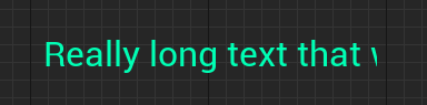
It's possible to set text to scroll like an old HTML marquee when the text no longer fits inside the desired size of the Common Text widget. To do this, follow the same process as with the Common Text Style Asset, but instead create a Blueprint subclass of Common Text Scroll Style, and choose your newly-created blueprint in the Scroll Style property of your Common Text instance.
Scroll Style Properties

Common Text Widget with Scroll Style Applied
Common Numeric Text Block
A subclass of UCommonTextBlock, the numeric text block displays an input float value as a Number, Percentage, Seconds or a Distance, with another property for options on how to display it.
It's effectively a widget wrapper around FText::AsNumber, FText::AsPercent, FText::AsTimespan and a custom implementation for distance using FUnitConversion::QuantizeUnitsToBestFit.
Appearance for each Numeric Type

Numeral Formatting Properties

Common Date Time Text Block
Subclass of UCommonTextBlock. Has helper functions for SetDateTimeValue(FDateTime) and SetTimeSpanValue(FTimespan). On setting a date time, it can also be set to count down.
Common Date Time Text Block appearance

Common Rich Text Block
This is a subclass of URichTextBlock and so behaves much like a standard Rich Text Block does; by default it uses the styling defined in a Data Table created using the Rich Text Style Row structure. However it also supports instead of using the row with ID default from the data table, using Common Text Style asset.
It also supports the same Scroll Style functionality as Common Text.
Common Rich Text Block Properties

Conclusion
If you are creating your own custom text widget, I would recommend looking at how the Common Text widget approaches centralised styling using Blueprint assets, as well as its scroll method for dealing with text that is too long (a frequent problem in localization).
Numeric and Date Time text blocks are also a great example of how custom widgets with a very specific purpose can be very useful to create if you have many of them in your UI. For example if you are constantly displaying prices in your game and they require some custom formatting, you could consider making a custom text widget (or just a User Widget).
While the plugin is still Experimental, I would recommend against using it in production.